Thoughts on a month of iPhone 6 Plus use
Posted by Wesley on
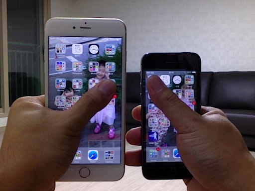
How far my thumbs go - iPhone 6 Plus (left) & iPhone 5S (right)
In my iPhone 6 Plus reviews, I've been focusing on the functions. But before wrapping this series up, I'd like to touch on the usability part. There will be a lot of existing iPhone users who's going to contemplate whether the huge screen is worth the risk. While iPhone 6 feels like a slightly enlarged iPhone 5S, 6 Plus is halfway to an iPad, a device that generally needs two hands to properly use.
Unlike an iPad, you can hold an iPhone 6 Plus with one hand just fine. This is due to its thinness and relative lightness. Using it in that manner is another matter, though. As you can see in the photo, the stretched screen of iPhone 5S (compared to 4S and earlier) already put some strain on the user's thumb when reaching the top corners. With iPhone 6 Plus, the thumb can realistically reach only about half of the screen area.

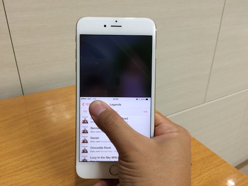
Using Reachability on iPhone 6 Plus to access top corners
So what did Apple do about it? It added a feature called "Reachability" to iPhone 6 series. When you tap (not click) the home button twice quickly, the whole screen slides down half way for a while. This is supposed to let you be able to touch the unreachable area, enabling you to touch anywhere with one hand.
In practice, though, still doesn't fully solve my problem of reaching the opposite top corner with my thumb, where navigation buttons usually reside. This is because the phone became wider as it has become tall. I could temporarily adjust the grip, but that increases the risk of dropping the phone.
Some apps get around this problem by providing the edge dragging gesture for navigating backward and forward. Thanks to this, Apple's default apps like Safari can be used with one hand more or less okay. But there are still a lot of apps that don't support this. So in essence, the Reachability is more of a temporary fix for when you have no choice but to hold the iPhone 6 Plus with one hand. If you can, don't hesitate to hold the phone with two hands. It's much better that way.

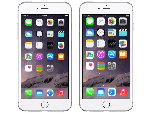
Standard (left) and zoomed (right) mode on iPhone 6 Plus
Once you accept the reality of the two-handed use, you will see that the larger display can be a blessing. Due to the higher pixel count (1920x1080 vs. 1136x640) and physical area (5.5" vs. 4.0"), iPhone 6 Plus is able to provide Display Zoom. In standard mode, the home screen and the supported apps are displayed at its native resolution (not technically true - see Note 1). In contrast, the zoomed mode shows everything in the traditional resolution, making them bigger.
In zoomed mode, you get to see the apps designed for 4.0" screen stretched to 5.5" without any modifications. Apps that aren't redesigned for iPhone 6 Plus will get the same treatment even in standard mode. If you thought the fonts on iPhone 5S or earlier models looked too small for your eyes, then this mode should alleviate it. My dad seems to like it a lot.
For those who were okay with the font size, the supported apps on standard mode gets to provide more information. This is the mode I've come to prefer. If you're doing a lot of web browsing, this is especially handy as the desktop version of the websites will be more usable.

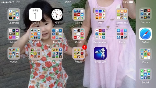
Rotated home screen in iPhone 6 Plus landscape mode
If you're in standard mode, another interesting thing you'll see is that the home screen will rotate, just like the iPads do. This is likely because iPhone 6 Plus may be used a lot in landscape mode with two hands. In this mode, if an opened folder has multiple pages, the next page will be partially shown on the right, utilizing the otherwise empty space. All of this does not happen in zoomed mode, however. It acts just like the previous iPhones with fixed portrait orientation for the home screen.
With the enlarged screen, iPhone 6 Plus certainly comes with reduced one-hand usability. Reachability tries to make up for this, but it isn't fully effective. But once you get over this and accept two-handed use, the larger screen size provides more opportunities for your eyes. As I've come to use the device for nearly a month, I feel that the trade-off was well worth it.
Note 1: iPhone 6 Plus has an internal native resolution of 2208x1242. But since the physical screen is 1920x1080, the contents are downsampled to this resolution for display. When you make a screenshot, the resulting file retains the 2208x1242 resolution. It's possible that next year's "iPhone 6S Plus" may come with a 2208x1242 display, removing the need for scaling and perhaps get a bit of performance boost.