Optimizing the site further for mobile devices
Posted by Wesley on
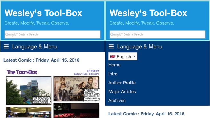
Navigation is now titled and language selection is moved inside the menu
For the past few days, you may have noticed that the website had received further updates in addition to some changes done earlier. Most notably, I modified some underlying code so that the menu bar is properly multilingual - it'll show in the selected language only. In addition, the tagging function got Korean localization. But I didn't stop there because there had been some requests from mobile users that I couldn't ignore.
With a responsive web design, the sidebar that used to be always present next to the main page gets moved to the bottom when the screen isn't wide enough, most notably on mobile devices. Because of this, functions available on the sidebar would become hard to find when viewed on a smartphone.
To rectify this problem, I decided to make further modifications to introduce some of the elements in the sidebar into the top area of the website as long as overall design could be preserved. First thing to try was the language selection box. After much experimenting, it was placed into the menu bar as the first item. This would also be nicely shown on a mobile version's navigation, as you can see here.
Unfortunately, the navigation itself didn't let the user know that they could change the website's language from there when it's collapsed and hiding everything within. So I gave it a label, so even a first time visitor would know now.
Next was the search box in the banner. The new theme uses the one that triggers the internal "quicksearch" function. While this gives you a nice list of posts that you're looking for, it's very slow in reality and doesn't work with the tagging plugin. So I decided to replace this with the Google custom search engine, which was already in the sidebar.
With the integration done, the now-redundant sidebar elements were removed. This is it for now, but if you have more suggestions, feel free to comment.