Server now on iMac and macOS High Sierra

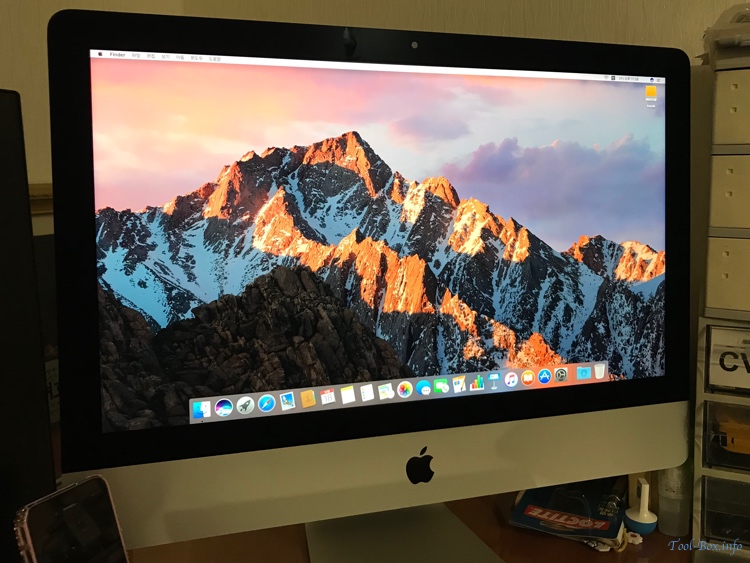
New iMac 21.5" 2017, freshly booted and ready to replace Mac mini 2012

The venerable Mac mini 2012, which took over the job of the server from the iMac 2008 in February 2013, showed signs of its age two months ago, refusing to boot due to corrupted Fusion Drive. I was able to remedy the problem, but I thought it may be a good time to move over to a new system. Seeing that Apple has not updated Mac mini in three years (and frankly, the 2014 edition was not an upgrade many had hoped for) I decided to return to using an iMac.

The iMac 21.5" 2017 was able to smoothly take over the Mac mini last month, but for some reason the system came equipped with macOS Sierra (10.12) instead of High Sierra (10.13) which was already a month old at the time. So I applied an extra caution and checked carefully that the apps I ran were compatible before manually upgrading. Finally, I made the switch to High Sierra today. It seems everything is functioning as expected.
Defined tags for this entry: , , , ,

Server upgraded to macOS Sierra

With major tasks at the workplace wrapped up, I decided that the National Foundation Day holiday would be a good time to upgrade the Mac mini server from El Capitan (OS X 10.11) to Sierra (OS X macOS 10.12). For a warm-up, I upgraded the MySQL Server installation from 5.6 to 5.7 before that, but I ran into some weird issues and took about an hour to resolve. After getting MySQL to work again, I made a full system backup and installed Sierra. With the new OS in place, I restored the server configuration and now you see that the website is back in action. iPhone 7 review will resume shortly.
Defined tags for this entry: , , , , ,

The slow updating of Google's Mobile Usability Report

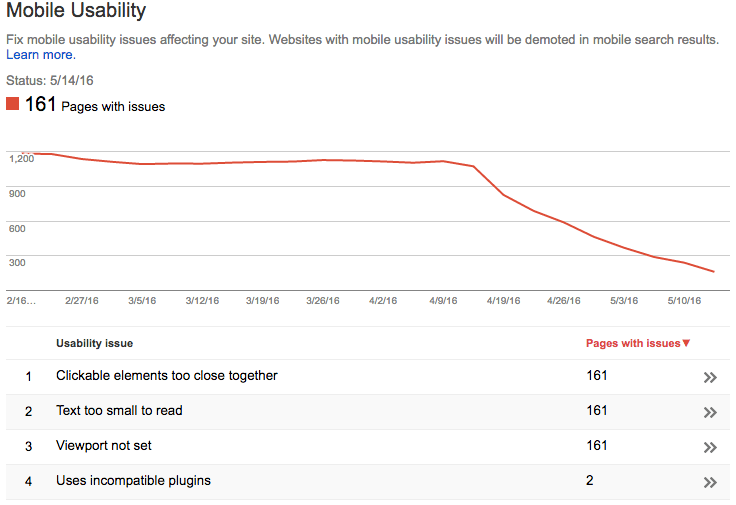
Pages with mobile usability issues as Google sees it, as of May 14, 2016

It's been more than a month since I revamped the site to be mobile friendly. Yet it takes quite a bit of time for Google to re-crawl all those pages and realize that they're have been changes. As you can see here, Google Mobile Usability Report still thinks roughly 15% of the indexed pages still aren't mobile friendly despite the fact that the template update affected the entire site at once. These pages would still show up in the search results without the "Mobile Friendly" tag and be ranked lower. I guess I'll have to wait a few more weeks.
Defined tags for this entry: , , ,

Optimizing the site further for mobile devices

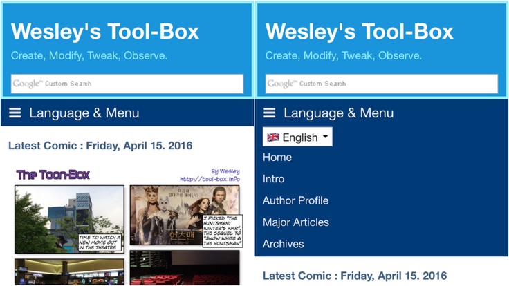
Navigation is now titled and language selection is moved inside the menu

For the past few days, you may have noticed that the website had received further updates in addition to some changes done earlier. Most notably, I modified some underlying code so that the menu bar is properly multilingual - it'll show in the selected language only. In addition, the tagging function got Korean localization. But I didn't stop there because there had been some requests from mobile users that I couldn't ignore.

With a responsive web design, the sidebar that used to be always present next to the main page gets moved to the bottom when the screen isn't wide enough, most notably on mobile devices. Because of this, functions available on the sidebar would become hard to find when viewed on a smartphone.

To rectify this problem, I decided to make further modifications to introduce some of the elements in the sidebar into the top area of the website as long as overall design could be preserved. First thing to try was the language selection box. After much experimenting, it was placed into the menu bar as the first item. This would also be nicely shown on a mobile version's navigation, as you can see here.

Unfortunately, the navigation itself didn't let the user know that they could change the website's language from there when it's collapsed and hiding everything within. So I gave it a label, so even a first time visitor would know now.

Next was the search box in the banner. The new theme uses the one that triggers the internal "quicksearch" function. While this gives you a nice list of posts that you're looking for, it's very slow in reality and doesn't work with the tagging plugin. So I decided to replace this with the Google custom search engine, which was already in the sidebar.

With the integration done, the now-redundant sidebar elements were removed. This is it for now, but if you have more suggestions, feel free to comment.
Defined tags for this entry: , ,

Site renewal ahead of blog's 20th anniversary

Updated Favicon

The first time I logged online was back in 1996, via the then-popular but now-defunct Nownuri online service. Later that year, I was able to connect to the Internet and create my own web page, hosted on another service provider's server. Internet Archives has retained a snapshot from 1999. It was the direct predecessor to this website, and it persisted until 2001 when I registered the Tool-Box.info domain, changed the blog's name to what it is now, and overhauled the design.

Then in 2005, the website was overhauled once again in order to use the Serendipity Weblog System (s9y), a PHP-based content management system, running on my home Mac mini computer. This system has been able to meet all my needs, so the basic framework has remained the same for the past 11 years. Only the updates to the software and hardware came and went in between.

When the current website was initially designed, I targeted the screen resolution of 800x600, which was more or less the minimum people's computers could do at the time. It has worked okay over the years, but the general horizontal resolution for the desktop computers had increased more than twofold, while the mobile devices often has less than half the targeted resolution even as its usage base skyrocketed. So the website's design could not serve either of the platform all that well.

This meant that I needed to redo the website design. I had considered creating a separate design for the mobile devices, but the existing solutions did not work as well as I hoped. Then I decided to try using a new theme included in the recent versions of s9y called "Next" which used the so-called "responsive web design." The theme automatically and dynamically adjusts the layout of the site content based on the screen size, which meant that I only need to keep a single theme and don't have to fiddle with web browser detection. This was the direction I wanted to take, so I got to work.

Throughout the weekend, I analyzed the ins and outs of the theme, then I made some changes to the style sheets and the template files to create a faithful successor to the original Tool-Box.info design. The graphics assets were updated or recreated to better work in multiple resolutions. If you accessed this website yesterday or the day before, you'll probably have noticed the ongoing changes. That work is now done.

Going forward, I hope the new design serves the needs of the visitors for the next decade well. The photos and the Toon-Box web toon that I upload will be in a higher resolution starting today to suit the new design, too. I have checked that the website works fine with modern web browsers with HTML5 support, for both desktop and mobile. But if you see any weird problems, feel free to notify me via the comments.
Defined tags for this entry: , ,

Copyright (C) 1996-2024 Woo-Duk Chung (Wesley Woo-Duk Hwang-Chung). All rights reserved.